Accumulated line plots with given X-labels
Creating an accumulated line plot, (or a filled accumulated area plot), with multiple data sets at given X-coordinates poses some specific problems when the coordinates for the different data sets are are not given at the same X-coordinates. This is a generic problem and has nothing to do with JpGraph library in particular.
To understand the problem we will make one simplifications (that is of no real consequence for the end result) that can be stated as
- the X-coordinates for all data tuples are whole positive number.
- the X-coordinates are in sorted order (non-descending)
The core issue can be illustrate as follows. Lets assume that we want to make an accumulated graph showing the two data sets
data set 1 == (0,5), (2,10), (3,10), (5,20)
data set 2 == (0,7), (1,12), (2,5),  (5,10)
In the above notation the tuple (0,5) means a data point with X-coordinate = 0 and Y-coordinate = 5.
What the library now needs to do is to first plot data set 1. No problem. When it then becomes time to plot the second data set we face an issue. The only points where we now the Y-value of data set 1 is at the given discrete points (0,2,3,5).
Plotting the first tuple for data set 2 shown above gives an absolute starting point at
(0,5+7) == (0,12)
The next data point we know for data set 2 is (1,12) so we need to plot this. But now we can see that we do not know the value for data set 1 at X-coordinate = 1. We only know the values at coordinates 0 and 2. This gives us a problem. We need to know at what offset we should plot this data point in data set 2 and we have no direct way of calculating this.
Now, one might argue that we could just interpolate between the data points (0,5) and (2,10) the Y-value at X=1 (doing a linear interpolation this would give the data point (1,7.5)) so why doesn't the library simply do this? It surely could be done.
Sidenote: In real life using this approach would be much more complex. First of all we need to create a linear succession of all X-values used in all data sets to create an ordered set and then fill in the blanks so that all data sets have values at all given X-coordinates. Those of you familiar with signal processing will recognize this as an (almost) upsampling of the original data sets follwed by a low pass filter.
However, by design the library doesn't do this. The crucial observation here is that it can not be a graphic libraires responsibility to "create" missing data points by making assumption that a particular polynom interpolation is valid (in this case a first degree approximation). What if a linear interpolation is not representative for the data set given? Perhaps a second degree aproximation would be more accurate.
So, this kind of data preparation must be done in the domain of the given data set where knowledge of the underlying data will allow an accurate preparation of the input to a graphing script if we insist of plotting an accumulated graph. One could argue that accumulated data plots can only be done for data series with the same X-coordinates.
Preparing the input data
So what if we are still required to do an accumulated plot even when we don't have all the data sets at the same X-coordinates? Going back to our original two data sets, hereafter referrered to as DS1 and DS2 there are 2 manual steps (as described above) that needs to happen.
- Identify all X-data points that needs to exist
- Create values for all data sets at those points
So, in DS1 and DS2 the union of the two data sets X-coordinates are
X_coordinates == union(DS1_x, DS2_x) == 0,1,2,3,5
This will force us to augment the two data sets as
data set 1 == (0,5), (1,??), (2,10), (3,10), (5,20)
data set 2 == (0,7), (1,12), (2, 5), (3,??), (5,10)
Where I have added '??' to indicate values that needs to be computed in order to draw an accumulated line/area plot at specific values. Now assume that we are able to find the missing data for these points by some method to be
data set 1 == (0,5), (1, 8), (2,10), (3,10), (5,20)
data set 2 == (0,7), (1,12), (2, 5), (3, 2), (5,10)
Are we now ready to plot these data sets? Unfortunately not quite. The remaining problem is that since the library only handles accumulated plots without a given X-coordinate (using an X-coordinate for the individual line plots will have no affect - and it's behaviour is undefined). This means that the data points are assumed to be equ-distance apart - and this is almost true for the data sets above. There is 1 unit between theme apart from the two last tuples which in fact have a distance of 2 units. In fact the library only plots data sets with a given Y-coordinate and then assumes that the X-corodinate is a linear ordering of (0,1,2, ..)
So in order to create a linear equ-distance ordered set we need to further augment the two data sets as
data set 1 == (0,5), (1, 8), (2,10), (3,10), (4,??), (5,20)
data set 2 == (0,7), (1,12), (2, 5), (3, 2), (4,??), (5,10)
So this means that we need to manually calculate another interpolated value. If we know we can make a linear interpolation (or perhaps find the data at this point) it will give us
data set 1 == (0,5), (1, 8), (2,10), (3,10), (4,15), (5,20)
data set 2 == (0,7), (1,12), (2, 5), (3, 2), (4, 6), (5,10)
This final data set is now ready to be sent to the AccLinePlot class. It is left as a (non-trivial) exercise to the reader to define and iplement a function that performs the steps outlined above to create proper data sets before reading on. The solution is given further down.
Creating plots with non-trivial X-coordinates
With non-trivial X-coordinates we mean for example timestamps or perhaps real numbers. For timestamps it is not so difficult. What we need to do is to identify the proper interval (in the orignal timestamp domain) and then create a mapping between that domain and the natural numbers (0,1,2,3,...).
The reason for this is that the library only accepts Y-coordinates as argument to the accumyulated dta series and will make the implicit assumption that when it plots the data it will plot the data points at consequtive values as if the X-coordinates had been given as (0,1,2,3,..). Hence we need to manually prepare the data to match this format.
As the final step we manually set the labels for the X-axis according to our interpretation. An example (with some code snippets) will make this approach clear.
Example - using timestamps
Assume we have the two data sets with timestamps
DS1 == (1212199200,12), (1212210000,20), (1212213600,30)
DS1 == (1212199200,12), (1212206400, 8)
and we now that the sampling interval between the data points are 7200s (=2 min). Following the same principle as above we need to find the additional values
DS1 == (1212199200,12), (1212206400,??), (1212210000,20), (1212213600,30)
DS1 == (1212199200,12), (1212206400, 8), (1212210000,??), (1212213600,??)
further assuming that we (by some method) can find these value we can then interpret this data as
DS1 == (1212199200,12), (1212206400,16), (1212210000,20), (1212213600,30)
DS1 == (1212199200,12), (1212206400, 8), (1212210000, 0), (1212213600, 0)
In the above we have made the explicit assumption that unknown data points at the end can be interpretated as 0 in this particular application.
We now have an ordered sequence of these tuples and we can imagine a mapping that will allow us to write these sequences as
DS1 == (0,12), (1,16), (2,20), (3,30)
DS1 == (0,12), (1, 8), (2, 0), (3, 0)
The mapping for this is xi=1212199200 + 7200*i, i=0..3 which we use when we put the final labels in the graph.
The only steps that remain to handle timestamps is to manually replace the X-scale (which in this case would be 0,1,2,3) with the calculated values according to the mapping given above.
We do this by creating an array of the timestamps we need to plot and then replace them - in situ - with an application of the standard PHP function array_walk() which applies a user defined function to each value in an array and replaces that value with the return value of the user function. In this case we create a user function that implements the mapping stated above with the additoinal twist that that given an argument as a time stamp it returns a suitable human format for that time stamp.
The following code fragments shows how this could be done
// Some userdefined human readable version of the timestamp
function formatDate(&$aVal) {
    $aVal = date('Y-m-d H:i',$aVal);
}

$timeStamps = array(212199200,1212206400,1212210000,1212213600);

array_walk($time,'formatDate');
when we now have the labels in a nice human readable format we can put them on the scale labels with
$graph->xaxis->SetTickLabels($timeStamps);
$graph->xaxis->SetLabelAngle(90);
though strictly not necessary we have also tilted the labels 90 degrees in order to minimize the risk the labels overwrite each other.
If we still think that the labels are too close together ea we can chose to only label every second tick mark. We do this with a call to
$graph->xaxis->SetTextLabelInterval(2);
Example using real X-corodinates
In prinicple this is handled in the same way as what we shown above for timestamps. The additional complexity here spells rounding errors. When we establish the equ-distant interval between each data point it will be a real number, potentially an irrational number, which means that we cannot represent it exactly and adding the interval repeated times might cause rounding errors if we are not careful.
Secondly we need to find a mapping between the ordered sequence of the real numbers we have as X-coordinates and the natural numbers which are the implicit X-coordinates assumed by the library.
Example
In the example below we artifically create some data sets where all the sets have values at all specified timestamps with the following code
//Create some test data
$xdata = array();
$ydata = array();

// Timestamps - 2h (=7200s) apart starting
$sampling = 7200;
$n = 50; // data points

// Setup the data arrays with some random data
for($i=0; $i < $n; ++$i ) {
    $xdata[$i] = time() + $i * $sampling;
    $ydata[0][$i] = rand(12,15);
    $ydata[1][$i] = rand(100,155);
    $ydata[2][$i] = rand(20,30);
}
Since the xdata array is given as timestamps we need to make this more human readable by converting the timestamp using the date() funtion. To do this we create an auxillary helper function and then use the array_walk() standard array function to apply this formatting to all existing values in the timestamp array as follows.
// Formatting function to translate the timestamps into human readable labels
function formatDate(&$aVal) {
    $aVal = date('Y-m-d H:i',$aVal);
}

// Apply this format to all time values in the data to prepare it to be display
array_walk($time,'formatDate');
The core of the script can now be written. For a change we make some adjustment from the default values of colors and tick mark positioning as a reminder that there is a lot of flexibility in creating the graphs.
// Create the graph.
$graph = new Graph(700, 400);
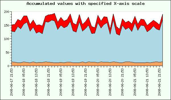
$graph->title->Set('Accumulated values with specified X-axis scale');
$graph->SetScale('datlin');
// Setup margin color
$graph->SetMarginColor('green@0.95');
// Adjust the margin to make room for the X-labels
$graph->SetMargin(40,30,40,120);
// Turn the tick marks out from the plot area
$graph->xaxis->SetTickSide(SIDE_BOTTOM);
$graph->yaxis->SetTickSide(SIDE_LEFT);
$p0 =new LinePlot($a);
$p0->SetFillColor('sandybrown');
$p1 =new LinePlot($b);
$p1->SetFillColor('lightblue');
$p2 =new LinePlot($c);
$p2->SetFillColor('red');
$ap = new AccLinePlot(array($p0,$p1,$p2));
$graph->xaxis->SetTickLabels($time);
$graph->xaxis->SetTextLabelInterval(4);
// Add the plot to the graph
$graph->Add($ap);
// Set the angle for the labels to 90 degrees
$graph->xaxis->SetLabelAngle(90);
// Send the graph back to the browser
$graph->Stroke();
The resulting image will now look something like this:
Helper function to creat interpolated data
The function InterpolateData() below takes two array of arrays and one integer as arguments. The first array of arrays contains the X-coordinates for each data set and the second array of arrays contains the Y-coordinates for all the data sets. The final integer argument is the distance (or samplerate) that should be assumed between each X-coordinate.
The function will return a tuple. The first element in the returned tuple is a single array with all the X-values that should be used and the second element is an array of arrays with all the Y-data sets with all data speciied for each X-coordinate. Any missing Y values are interpolated using a linear interpolation schema.
So using our first example above as demonstration this would be handeled as
$datax = array(
    array(0,2,3,5),
    array(0,1,2,5));

$datay = array(
    array(5,10,10,20),
    array(7,12,5,10));

list($datax, $datay) = InterpolateData($datax, $datay);

// $datax = array(0,1,2,3,4,5)
// $datay = array( array(5, 8,10,10,15,20),
//                 array(7,12, 5, 2, 6,10));
One possible implementation of this function is given below. It has primarily been written for clarity and not necessary high performance. To interpolate the "missing" Y-values a linear approximation is assumed.
function InterpolateData($aXData,$aYData,$aSampleInterval=1) {

    // First do some sanity checks on the input data
    $nx = count($aXData);
    $ny = count($aYData);
    if( $nx != $ny )
        return array(false,-1);

    for( $i=0; $i < $nx; ++$i ) {
         if( count($aXData[$i]) != count($aYData[$i]) )
             return array(false,-2);
    }

    // Create the sorted union of all X-coordinates
    $unionx = array_union($aXData);
    $length = count($unionx);

    // We now have to make sure that the distance between all
    // X-coordinates is 1 unit of the sample interval. If not
    // we will have to insert suitable X-value
    $i=1;
    while( $i < $length ) {
	$missing = 0;
	$diff = $unionx[$i] - $unionx[$i-1];
	if( $diff != $aSampleInterval ) {

            // Sanity check to make sure sample interval is an even multiple
            // of the distance between the gven X-coordinates
            if( $diff % $aSampleInterval !== 0 ) {
              return array(false,-4);
            }

	    $missing = $diff / $aSampleInterval - 1;
	    $fill = array();
	    for( $j=0; $j < $missing; ++$j ) {
		$fill[$j] = $aSampleInterval*($j+1)+$unionx[$i-1];
	    }
	    $unionx = array_merge(
		array_slice($unionx,0,$i),$fill,array_slice($unionx,$i));
	}
	$i += $missing+1;
	$length += $missing;
    }

    if( $length != count($unionx) ) {
        // Internal error check
        return array(false,-3);
    }

    // Now loop through all the individual data sets and find out
    // which x-data is missing and hence needs to be interpolated
    $n = count($aXData);

    for( $i=0; $i < $n; ++$i ) {
	$missing_values = array_diff($unionx, $aXData[$i]);

	// Now find the position of each missing X-coordinate
	// and use that position in the corresponding Y array
	// to insert an interpolated value
	$m = count($missing_values);
	foreach( $missing_values as $key => $val ) {
	    $idx = array_search($val,$unionx);

	    // Now split the Y-array at that position and insert
	    // a new sentinel value
	    if( $idx >= 0 ) {
		$aYData[$i] = array_merge(
		    array_slice($aYData[$i],0,$idx),
		    array(NULL),
		    array_slice($aYData[$i],$idx));
	    }
	}

	// The next step is to actually calculate an interpolated value
	// for the Y-coordinates we don't have. As a special case any
	// beginning or ending non-defined coordinates are set to 0

	// Set all beginning NULL to 0
	for( $j=0; $j < $length; ++$j ) {
	    if( $aYData[$i][$j] !== NULL )
		break;
	    $aYData[$i][$j] = 0;
	}

	// Set all ending NULL to 0
	for( $j=$length-1; $j >= 0; --$j ) {
	    if( $aYData[$i][$j] !== NULL )
		break;
	    $aYData[$i][$j] = 0;
	}

	// Calculate the remaingin missing values as a linear
	// interpolation and keeping in mind that there might be
	// multiple missing values in a row.
	$j = 0;
	while($j < $length ) {
	    if( $aYData[$i][$j] === NULL ) {
		// How many unknown values in a row?
		$cnt = 1;
		while( $j+$cnt < $length && $aYData[$i][$j+$cnt]===NULL ) {
		    ++$cnt;
		}

		if( $cnt == 1 ) {
		    $aYData[$i][$j] = ($aYData[$i][$j-1]+$aYData[$i][$j+1])/2;
		}
		else {
		    $step = ($aYData[$i][$j+$cnt] - $aYData[$i][$j-1])/($cnt+1);
		    for( $k=1; $k <= $cnt; ++$k ) {
			$aYData[$i][$j+$k-1] = $step*$k+$aYData[$i][$j-1];
		    }
		}
	    }
	    ++$j;
	}
    }

    return array($unionx,$aYData);
}


//------------------------------------------------------------------------
// Helper function to create the union of two arrays
//------------------------------------------------------------------------

// Create the sorted union of all numeric arrays given as argument
function array_union($a) {

    $n = count($a);
    $res = $a[0];
    for( $i=1; $i < $n; ++$i) {
	$res = _array2_union($res,$a[$i]);
    }
    sort($res);
    return $res;
};

// Return the union between two numeric arrays
function _array2_union($a,$b)
{
    if( $a == NULL ) return $b;
    if( $b == NULL ) return $a;

    // A standard "trick" to calculate the union of two arrays
    return array_merge(
	array_intersect($a,$b),
	array_diff($a, $b),
	array_diff($b, $a));
}
Downloads
The following archive contains a full version of both the example script that produces the graph above as well as the helper function.
